What is skeumorphism?
During the advent of touch screen mobile phones, the concept of having a mobile phone that is mostly screen, save for a couple of tactitle buttons or two at the bottom of the screen, was unfamiliar to most. People of past generations were accustomed to mobile phones and digital devices having tactitle buttons to use to navigate the many functions of their devices. The buttons were fixed, always the same no matter what the application.
Then touchscreen phones came and changed everything. User interfaces were no longer designed to be centred around the devices’s limited hardware functions. The screen was now free to be whatever it wanted to be, keyboards could now vary depending on the type of application used, some user interfaces required no keyboard at all. The possibilities were endless. This is very good and all, but then comes the issue of: How do we design the user interface for an unfamiliar device, such that it would be user friendly for age groups across all generations?
The answer to this: Skeumorphism.
Now what is skeumorphism? It is a design framework, where user interfaces are designed to mimic their real world counterparts as much as possible. This way, user interfaces would be more intuitive, easy to learn and familiar to users on an otherwise unfamiliar device.
A prime example of the applications of skeumorphism, would be the first iterations of the user interface of the iPhone and its applications.
Image 2: A wheel number picker for selecting times on the iPhone alarms app
Image 3: A random calculator app
The iPhone was a completely new and alien device to users of old phones with the d-pad and everything. Yet it was so easy to use! Why? Skeumorphism. The way the interfaces are designed, look so similar to the real thing, you just know how to use them, even if you’ve never used an iPhone before.
As the popularity of touch screen phones boomed, the world became more and more familiar with the way touch screen devices worked. It has become second nature to our generation, and soon after, skeumorphism became an ugly, disgraceful thing of the past. Now, we favour flat, material design that provides less clutter to the eyes, and is overall cleaner and simpler.
Why am I talking about skeumorphism, and how in any way is this related to locomotion in VR? Why did Vivian Balakrishnan lie in parliament when he told us all that our trace together information would be private and not used for anything other than contact tracing?
Well, for the first question, skeumorphism and locomotion in VR have one very important thing in common: the importance of designing to meet user’s needs.
Learning from the past
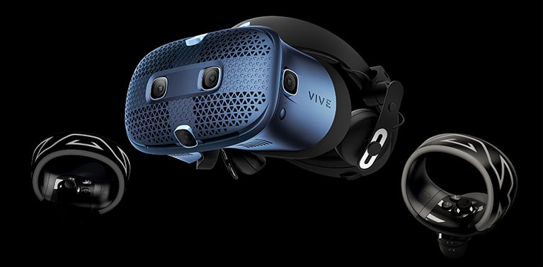
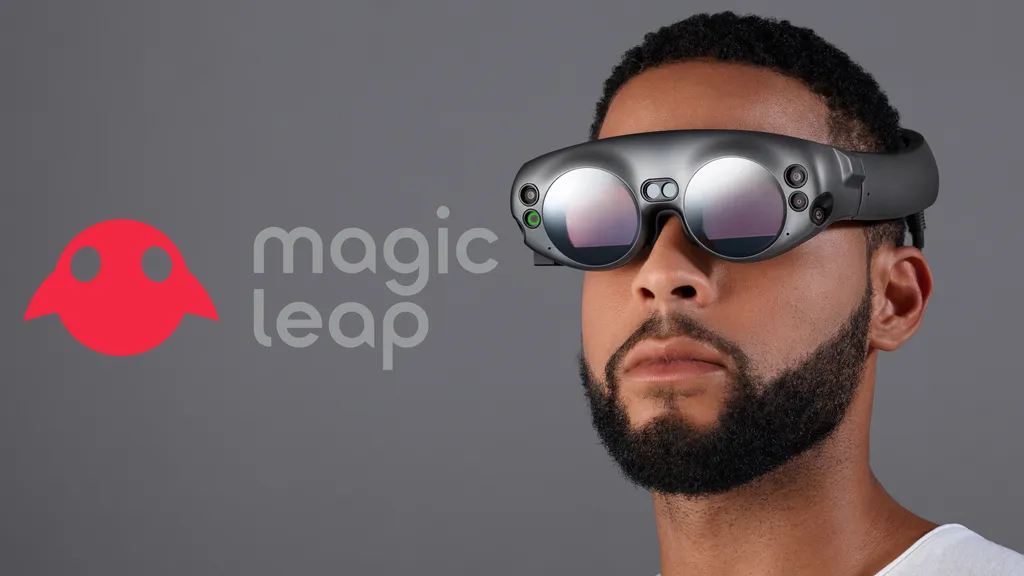
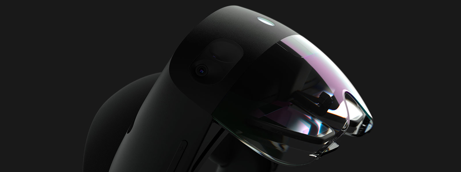
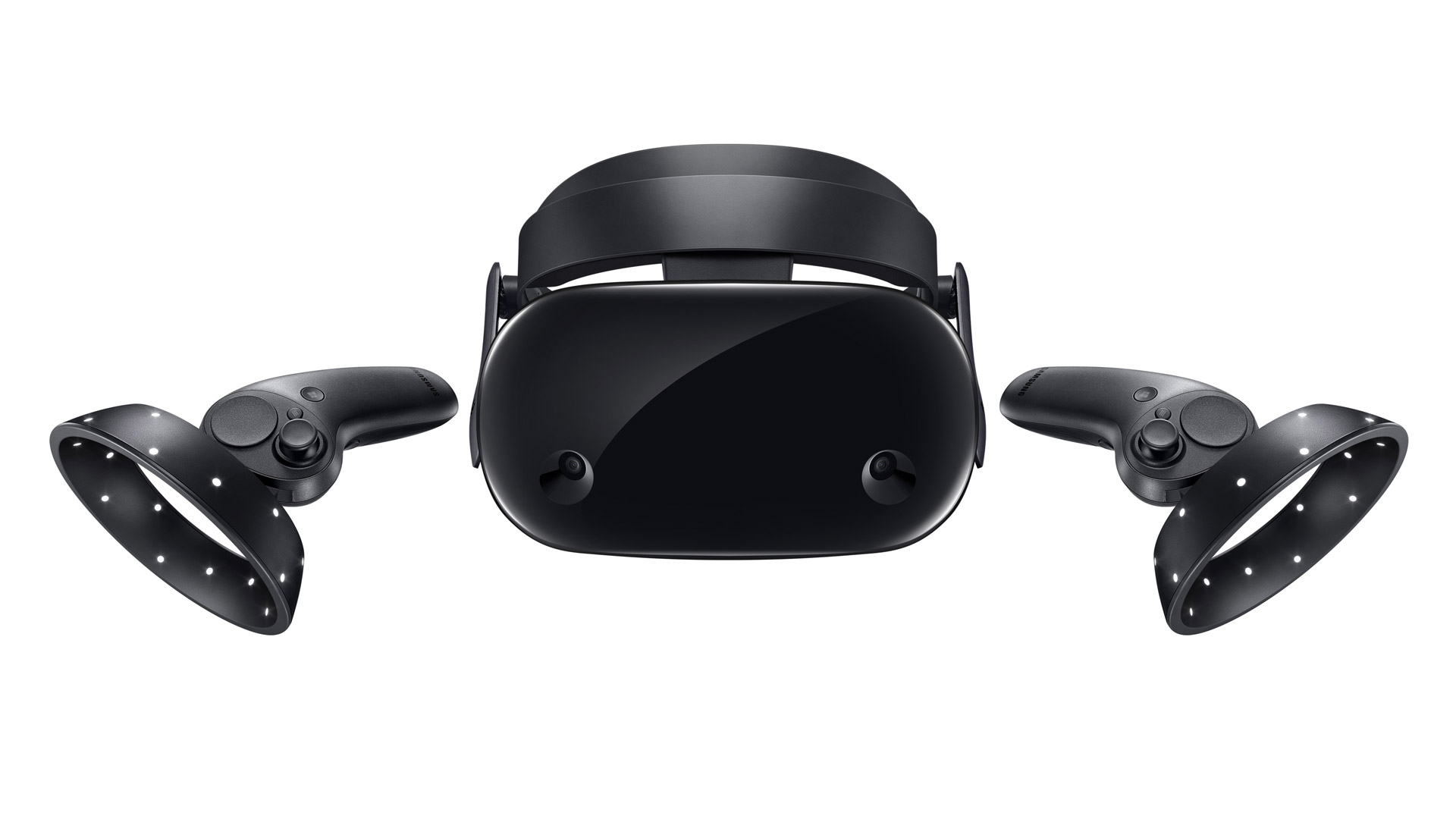
VR to be quite frank, is not a very accessible technology, even in 2021. The average price of a VR gaming headset, is around $600. About the same price as a nintendo switch, which you THINK is popular and accessible, but really it isn’t, you’re just surrounded by rich and privilleged friends. However, we canot deny that the popularity of VR gaming has been on the rise for quite some time now.
Just like the iPhone, with VR, the possibilities are endless. With this wide scope when it comes to implementing user interfaces and features, it is hard to come up with interfaces and experiences that are comfortable and familiar to its users. Not to mention, the level of immersion that VR brings to the table is otherworldly. The illusion VR provides tricks the brain so much so that certain actions and motions in-game can cause motion sickness, even if the player is sitting on their couch doing nothing.
What are some ways that we can improve this new technology, to make it more familiar and comfortable to its users? The answer to this.. is.. you know what it is! Basically, designing VR interactions such that they mimic the real world as much as possible. This may seem pretty counterintuitive, isn’t the whole premise of VR to give users experiences that are out of this world, that are unachievable in real life? Well yeah.. that’s true and I’m not sure how to explain myself on this point. I guess in some sense, introducing people to VR is kind of like trying to teach a kid how to ride a bike. First you start with the training wheels (skeumorphism), after the kid learns how to ride the bike, you throw away the ugly, disgraceful training wheels, never to be used again.
The bottom line is: Bring the use of skeumorphism to designing locomotion experiences in VR.
Idea 1: More Audio Cues
When we do things in real life, (if you are not deaf), there are always audio cues to help you navigate and understand the world. When a player is travelling through the in game world by some means, be it walking, teleporting, whatever, it would be good to add audio cues to help players get a sense of what is going on. E.g., if a player is walking, noises of footsteps may help to reduce sensations of being disoriented, as the audio cues may help as a guide for the brain.
Idea 2: Introducing drag to head movements
When we move our heads in real life, there is a certain limitation to the speed of our head movements. Also, did you know that our brain automatically adds motion blur to our vision to avoid motion sickness? Often times in VR, the images/graphics are so crisp, coupled with the sensitivity of the HMD when detecting head movements, may cause motion sickness. We can avoid this by adding some artificial drag when players move their heads in the game. Rather than the HMD immediately responding to a person’s head movements, the game can be configured such that the change in the player’s FOV is more gradual and less sensitive to the player’s actual head movements.
Idea 3: Teleportation Improved
While I was taking CS4240, the game that my team and I developed had a function for players to teleport to locations across the map. While this is good in eliminating some motion sicknes, I actually still get motion sickness due to the sudden nature in the change of the scenery. We can circumvent this, by creating some kind of crossfade between the scenes. This can also act as a visual cue to let the brain know that the scene is about to change, like how crossfades and different transitions are used in films to switch between different scenes.
Conclusion
Real talk, I’m not sure if these ideas are the best, because it’s hard to say if an idea really works unless it’s backed by actual experience and research. The ideas have to be tested on real people in order to be able to conclude that the method really works in reducing motion sickness. Also, because my expertise on VR technology and interaction design is limited to only 1 module I took that spanned only 10+ weeks (CS4240), I cannot say that I am very experienced with this whole VR thing. But I have tried my best in coming up with interesting ideas. What do you think about my skeumorphic approach to improving locomotion in VR? SMASH THE LIKE BUTTON, SUBSCRIBE, AND LEAVE YOUR COMMENTS BELOW!!




/cdn.vox-cdn.com/uploads/chorus_image/image/63333637/ss_4c0730d4926771f9a99c72bc4f0b836843975dc5.1920x1080.0.jpg)
